Designing a Smarter EHR Chart for Faster Care
Improved chart clarity and reduced admin time for clinicians during patient visit preparation.
1. Project Summary
Background
With over 500 clinicians, Cerebral serves 1000+ patients monthly. Clinicians spend 10-30 mins reviewing patient info before each visit. How can we optimize this process?
Cerebral's Electronic Medical Record (EMR) is a vital tool for healthcare providers, serving as a central repository for all patient and clinician information. Improving the process of reviewing patient charts is critical for enhancing clinician efficiency, reducing the time spent on administrative tasks, and ultimately improving the quality of care delivery. This project is focused on streamlining the EMR review process to improve the visit experience for clinicians and optimize the overall care delivery process, supporting Cerebral's objective of building a large, loyal, and high-quality base of clinicians.
How might we improve the user experience of the patient chart to increase clinician efficiency and satisfaction?
Pain Points
- Unclear pre-visit preparation process and relevant patient information for clinicians.
- Confusing and limited patient information navigation with few actionable links within the chart.
- Clinicians spend excessive unpaid time reviewing patient information due to lack of compensation.
Approach

- Research user needs and behaviors.
- Interview mental health professionals and patients.
- Observe users interacting with the current page.

- Synthesize research findings.
- Develop user personas and scenarios.
- Define project scope, goals, and metrics.

- Brainstorm design ideas.
- Evaluate ideas based on user needs, feasibility, and goals.
- Develop sketches, wireframes, and flow diagrams.

- Build low-fidelity prototypes.
- Conduct usability testing sessions.
- Iterate on the design based on feedback and insights.
Solutions
- Build a patient summary section within the patient chart for fast information consultation.
- Work on the information architecture of the patient chart to facilitate navigation.
Success Metrics
- Reduce clinician admin time before and during visits.
- Decrease time needed to retrieve key client information.
- Reduce visit preparation time.
- Decrease time to action key decisions during a visit.
- Improve visit quality for patients.
2. Process
Discover
Research Approach
Hypothesis: Improving the EMR client page layout and providing a patient summary of key metrics and insights will improve clinician efficiency and the client visit experience.
- Goal one: Identify the key information clinicians need to review during patient visits.
- Goal two: Identify the most challenging aspects of the current client chart layout for clinicians.
- Goal three: Understand the workflow and preparation process of ILV prescribers and how it contributes to successful visits, compared to the workflow of prescribers for normal, scheduled visits.
- Goal four: Compare the workflow and behavior of clinicians receiving high vs. low client feedback to uncover successful practices.
Research Methodology
User interviews: Conducted 30-minute interviews with six therapists and 5 prescribers to understand their perspectives on patient information, EMR pain points, and visit workflows.


Shadow sessions: Observed the visit preparation and process of two therapists and three prescribers to gain insights into their workflows and pain points.

"It's like going on a scavenger hunt for the right information, you have to keep expanding and scrolling down to the very bottom to find what you need." - Cerebral clinician from user interview
Stakeholder workshops: Conducted workshops to gather long-term performance goals, identify common frustrations and areas of opportunity, and prioritize themes.


Clinician workshop with Clinical Advisory Board: Collaborated with Clinical Advisory Board members to gain insights on valuable information for visit preparation and potential organization within the EMR.

Research Synthesis: I synthesized the information gathered during the research phase by creating a research board on Miro. I gave each note a tag to organize information and made a heat map to identify pain points. From there, I pulled insights and created clusters to notice trends and determine conclusions. This process, along with findings from previous workshops, helped me draw conclusions from the overall research.

High-level Findings
During my research, I uncovered several significant issues in the areas of process inconsistency, information hierarchy, and technical design, each of which had a direct impact on clinician workflow. These findings are outlined below:
Process Inconsistency:
- Impacts patient notes quality: The quality of patient notes is highly dependent on the thoroughness and structure of the clinician who writes them. Trends were identified in high scored notes.
- Inefficient visit preparation: Low quality notes cause longer preparation time for visits, which results in frustration and confusion for clinicians during visit preparation.
Information Hierarchy:
- Lack of patient summary experience: Clinicians require additional administrative time to properly prepare for visits due to the lack of patient summary experience.
- Inaccurate and inadequate flags: There is no reliable way to track high acuity alerts and events, which directly impacts client safety.
Technical Issues:
- Layout challenges: There is wasted and unused space towards the top of the screen, which results in a confusing user interface and overwhelmingly dense information areas further down.
- Navigation challenges: Clinicians experience excessive scrolling and jumping around the patient chart to find needed information.
Define
Clinician Visit Profiles
To better understand the needs and behaviors of clinicians in the patient visit process, two distinct clinician visit profiles were developed based on analysis of user interviews and chart auditing data.

On-the-Spot Reviewers - Average Audit Score: 3.525 / 5
Limited time and no compensation for pre-visit preparation means I rely on quick assessments of patient information at the start of each visit.
This group had a less defined breakdown of the visit process and key information important for their workflow. Additionally, their chart audit scores tended to be lower compared to those of the first group.

Dedicated Preparers - Average Audit Score: 4.465 / 5
Even though I won't be compensated for my time, I dedicate extra hours before work or the night before to review patient information and ensure I'm fully prepared for their appointments.
This user group demonstrated a more structured and systematic approach during patient visits, with a clear breakdown of their visit process and key information required. Additionally, they tended to have higher chart auditing scores, suggesting a strong attention to detail and a commitment to maintaining accurate patient records.
Restructuring Chart IA & Navigation
Based on research findings and clinician user interviews, the usability and navigation of Cerebral's Electronic Medical Record (EMR) system were identified as consistent pain points. To address this, the project focused on reworking the Information Architecture (IA) for the patient chart. The goal was to streamline navigation, achieved by consolidating tabs and buttons and transitioning sub-navigation to a left panel. This resulted in a more intuitive and user-friendly design, improving the overall usability and efficiency of the patient chart.

Crafting User Stories
To ensure that the new patient summary page and chart navigation design meet the needs of our users, I worked with the product manager to develop user stories based on research insights. These user stories serve as a guide for the design and development process, keeping the user's perspective at the forefront. By basing the user stories on research findings, we were able to create a more user-centered design that addresses specific user challenges and goals. Here are some of the user stories we developed to ensure the new design meets the needs of clinicians:
- As a clinician, I want to be able to see a summary of a patient's medical history on one page so that I can get a quick overview of their health status.
- As a clinician, I want to be able to easily navigate through the patient chart, so I can quickly access the information I need to prepare for a patient visit.
- As a clinician, I want quick links within the patient chart so that I can easily navigate to related sections without having to manually search for them. This will save me time and improve my efficiency during patient visits.
- As a clinician, I need a clearer UI with improved information hierarchy, so that I can quickly identify the most important patient information and make informed decisions about patient care.
Design
Wireframes
During the wireframe process, I leveraged research insights to design an optimal patient chart that improved clinician workflow by creating a patient summary and reworking the chart's internal architecture. This included optimizing navigation and enhancing information retrieval efficiency. The wireframe phase was crucial to ensure that the final product addressed user needs and pain points identified during research before proceeding with high-fidelity designs.


I presented two patient summary design options to the team. The first utilized the current patient chart's tab navigation, while the second introduced a new left panel sub-navigation to save screen space and allow for future scalability. I tested the wireframes with clinical stakeholders to determine the best option and made adjustments as needed. Additionally, I consulted with the engineering team to ensure the feasibility of the design within the project timeline. Ultimately, the team concluded that the second option, featuring the new, collapsible, left panel sub-navigation, was the optimal choice to achieve our goals.
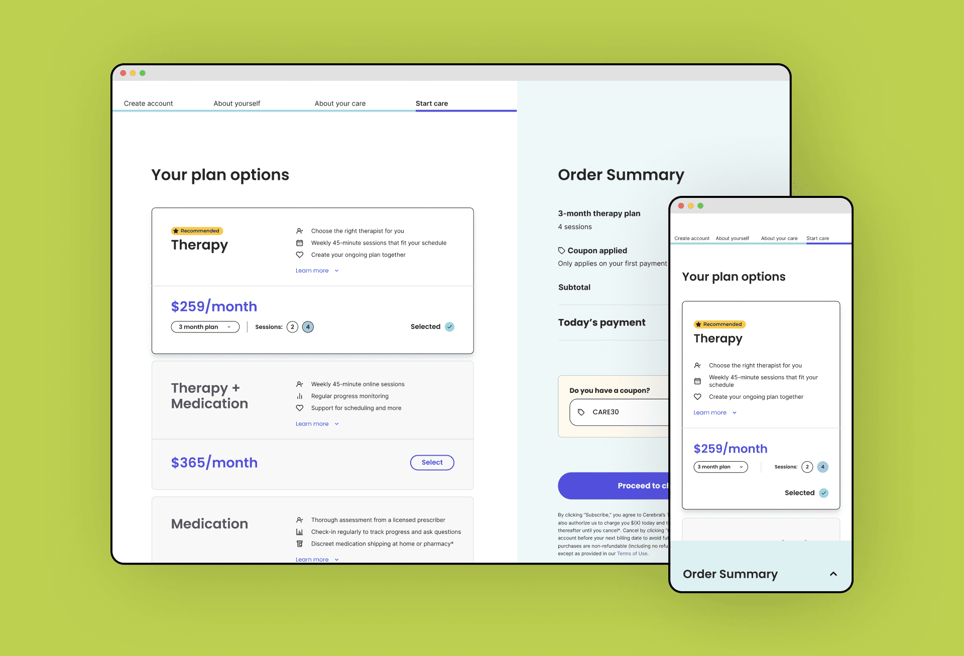
Hi-fi Mockups
The new patient summary page aimed to create a centralized area for users to efficiently review important patient information. The updated UI matched the new design system in the EMR, while the improved hierarchy and visibility of patient visit information and the reworked chart navigation allowed for more efficient retrieval of information. The previous chart had outdated and confusing UI, which made it challenging for users to find the necessary information.


The patient chart's new IA was integrated with a collapsible sidebar navigation in the patient summary page design, optimizing screen space and giving users more control for a cleaner and focused view of patient information. It also allows for future scalability without compromising user experience.
Deliver
By the end of this project I delivered:
- Research report that outlines all the major user pains and needs around the patient chart
- Recommendations on how to improve the patient chart and when to implement these changes
- User stories that guided the design and development of the new patient summary page and chart navigation
- Wireframes and prototypes that visually represent the new patient summary page and chart navigation design
- Final design assets and specifications for implementation
3. Conclusion
Takeaway
The newly implemented patient summary and chart navigation in the Cerebral EMR have successfully addressed the pain points and inefficiencies identified in the user research. The updated navigation provides clinicians with easy access to important patient information, while the intuitive and organized layout of the patient summary displays the most relevant and actionable information at the top of the page, reducing administrative time before and during a visit. This improvement allows clinicians to make better use of their time and make informed decisions during client visits, ultimately leading to better patient care.
Next Steps
After the successful creation of the patient summary and the implementation of new chart navigation, there are several suggested next steps to continue improving the patient chart redesign project:
- Conduct usability testing on the new patient summary page and chart navigation to identify areas for improvement.
- Iterate on the design based on feedback and usage data to further enhance the user experience.
- Implement UI updates to other pages of the patient chart based on the recommendations.
- Conduct a post-implementation evaluation to measure the success of the redesign project and identify any remaining issues.
By taking these steps, the project will continue to improve the efficiency and quality of clinician workflows provided by the Cerebral EMR.